Loading
...
...

CB hired me to work through the asthetics and workflow of an upcoming email campaign tool.
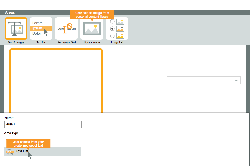
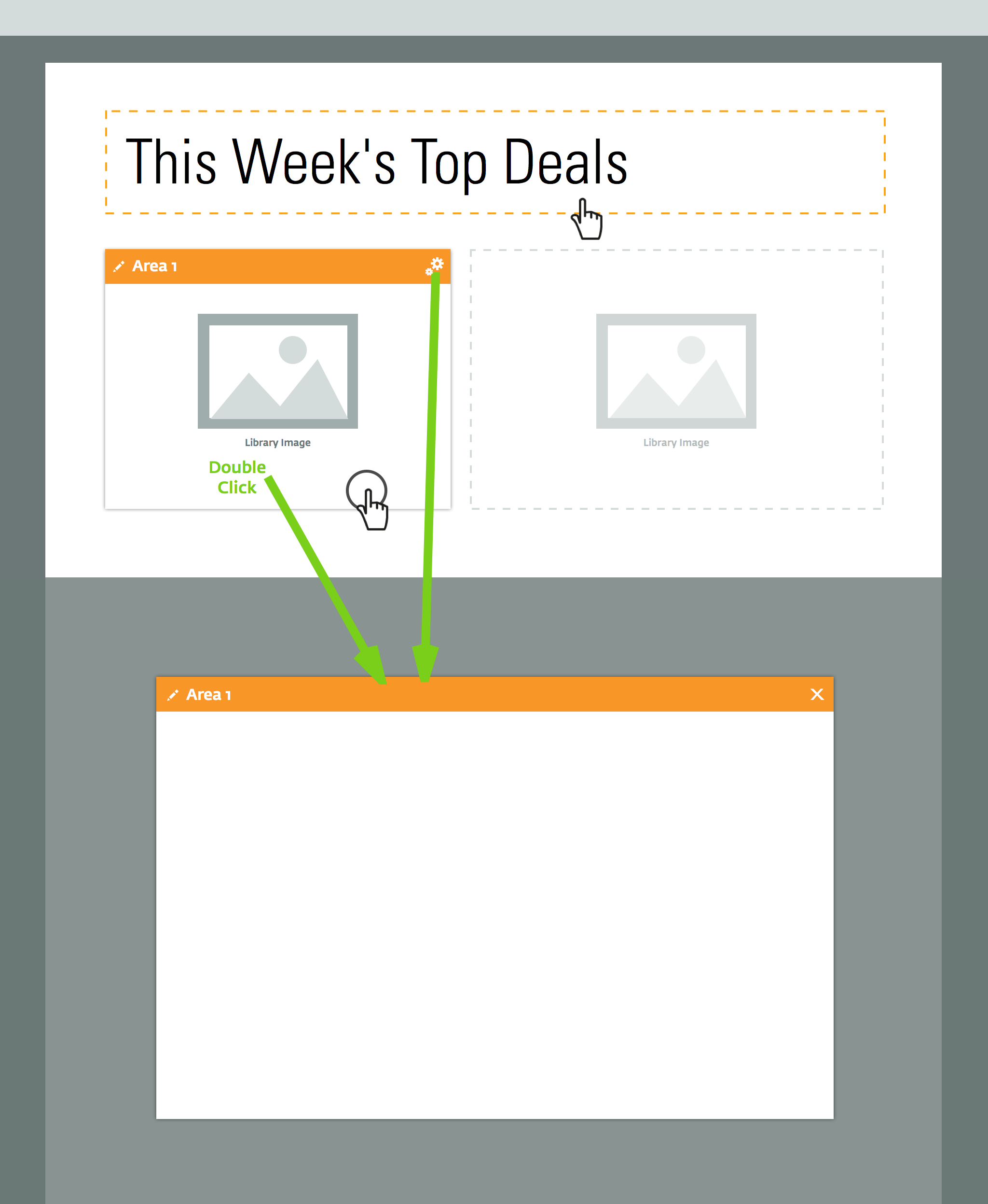
The campaign builder had to pack a lot of functionality into a user-friendly menu. Users were not just creating custom emails but the templates other users (e.g. employees within the users' companies) would use to make emails repetitively.
One of the first things I like to do on such a project is to create a UI Kit.
UI Kits prevent designs for individual UI elements from going astray. I learned the utility of this while working for Ipreo. Before we had our UI Kit in place, we'd design an element for one page, using all the right colors and fonts, but somehow, other elements on other pages didn't seem to match.
The kit simply crams the elements into a collage. When new elements are created, I try to reuse details from other elements and I can easily verify the perceptive congruency of the design element-to-element.
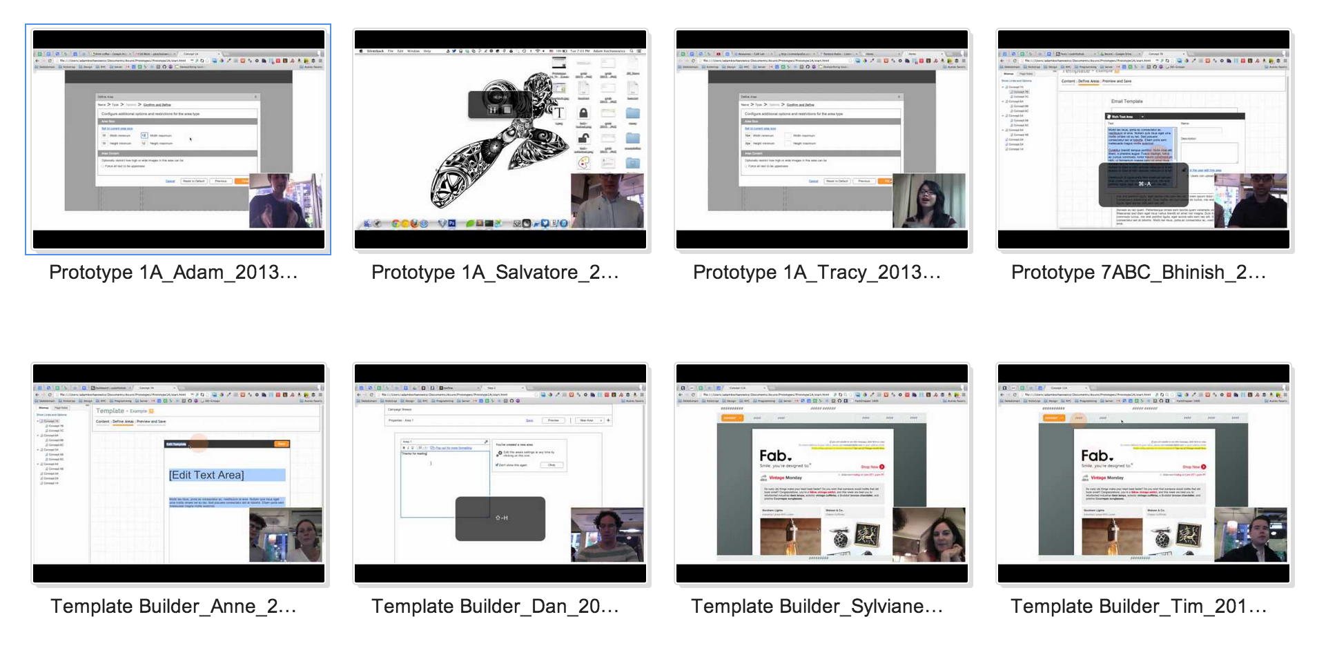
User Testing
For the early prototypes/mockups, I don't actually make the buttons do or say anything. This allows me to ask users where they think they should press to perform a certain action. If I find most users are clicking in the top right to save an email, that tells me I should probably put the button there.
This makes for a great user experience because I can anticipate user behavior inherently in the design.
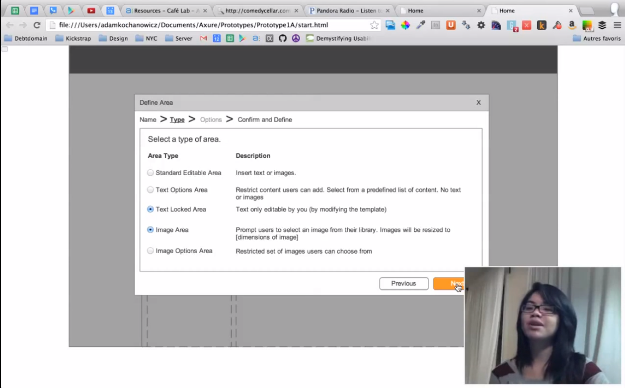
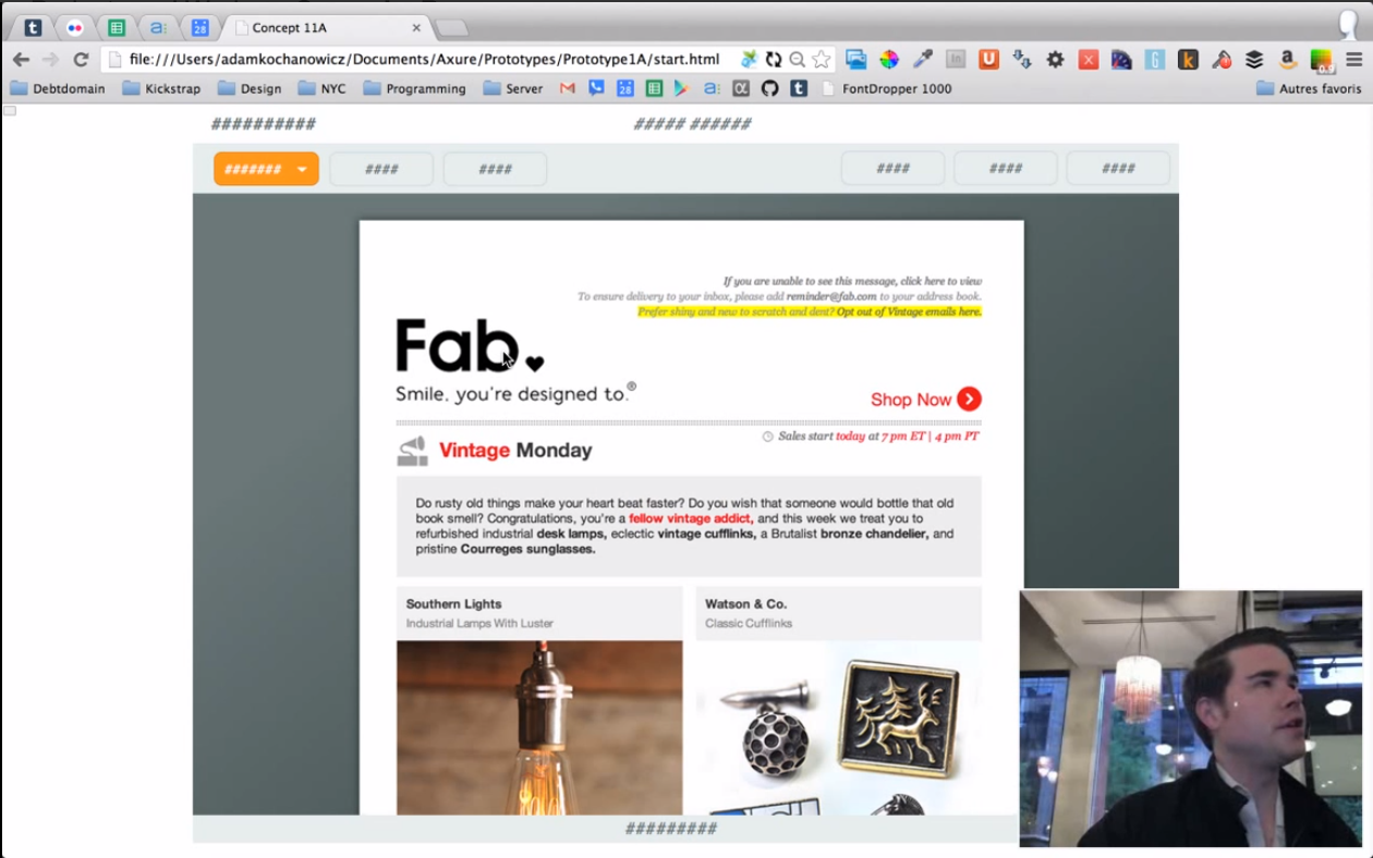
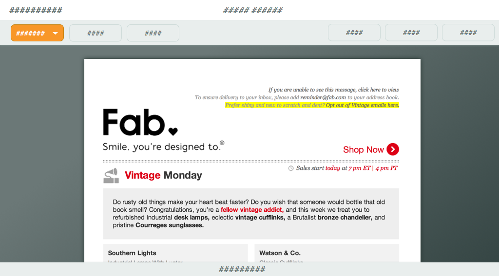
Other mockups were created just to convey some of the ideas at play with the company before any user testing was done. The images attached in this article are just a few of many iterations of concepts.
For user testing, I would offer free coffee to patrons of coffeeshops in exchange for some of their time testing the application. User tests were performed periodically and between large iterations of the design.